2023 App Store and Google Play Screenshot Design Guidelines
Contents
- 1. Use The Right Screenshot Size
- 2. Upload Multiple Images
- 3. Take Advantage of Video
- 4. Walk Through Key Functionality and Make Sure You Showcase Your App’s Value
- 5. App Store Screenshots Caption – Clean and Easy to Read
- 6. If You Go Global, Localize Your Apps!
- 7. Screenshots Orientation (Portrait vs Landscape)
- 8. App Screenshot Colors and Backgrounds
- 9. App Store Screenshots Style
- 10. A/B Test and Test Again
- Closing Note
Great app store screenshots are critical to making your app store listing attractive to drive more downloads. Many mobile users will use your app screenshots to form a first impression and decide whether or not they want to download your app.
In this post, we summarized 10 most practical app store screenshot guidelines for both App Store and Play Store to help you improve conversion rate and get more downloads. Please note that good screenshots are not only helpful in getting more organic downloads but also the paid one. That’s because your app store listing is also the landing page for your ads.
Let’s go to check the guidelines below to create impressive screenshots and get more downloads.
1. Use The Right Screenshot Size
First of all, you need to use the right app screenshot sizes to make sure your app is approved by Apple or Google. Cannot remember too many screenshot size for different devices like iPhone, iPad, Android phone and Android tablet? You can check the whole list of App Screenshot Sizes for App Store & Google Play
2. Upload Multiple Images
This should go without saying, but some developers only upload 2 screenshots in their app store listing. Apple allows you to upload up to 10 screenshots and Google Play gives you 8 slots for screenshots. In most cases, you should upload as many screenshots as the platform allows. Why? This is your chance to showcase your app in all its glory. Every additional screenshots are an added opportunity to advertise why people should download your app.
3. Take Advantage of Video
Both Apple App Store and Google Play allows you to upload promo videos. The video can demonstrate the features, functionality, and UI of your app which helps users learn more about your app and increase your app’s conversion rate.
On iOS you can have up to 3 videos, and since iOS 11 they autoplay as you swipe to put them in focus.
On Android you can have only 1 video. Following the redesigned Google Play Store rolled out September 2018, the video play button still appears over the feature graphic but this is now within the Gallery.
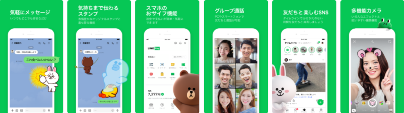
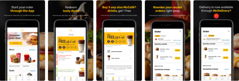
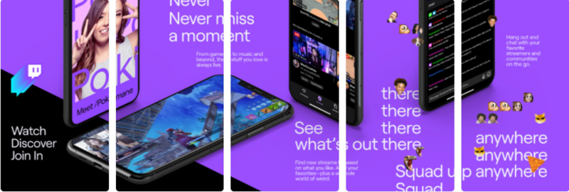
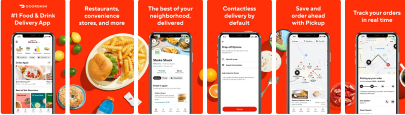
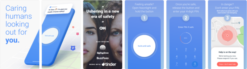
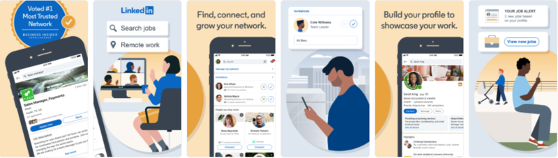
4. Walk Through Key Functionality and Make Sure You Showcase Your App’s Value
It is important to show off key features to compel users to download. Also, you’d better put the screenshots that shows your app’s main features in first because users may only check a few screenshots. Also, if you made recent updates to your app, make sure you include them in the screenshots. This will not only entice new users to download but could also attract users who have churned back to your app.
Rather than explain what ‘killer copy’ looks like, I’ll show you with the below examples.
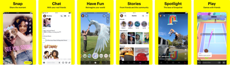
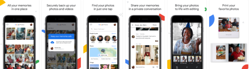
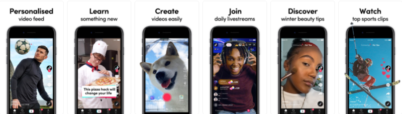
5. App Store Screenshots Caption – Clean and Easy to Read
App publishers prefer to add a short descriptive text to highlight the features. Please keep in mind that adding caption makes no sense unless it’s easy-to-read, short, and clear. The truth is app store visitors don’t open full-screen gallery normally, so it’s important to make fonts bold and readable even from product page thumbnails of screenshots. Usage of call-to-actions is encouraged. App’s features are to be emphasized with verbs.
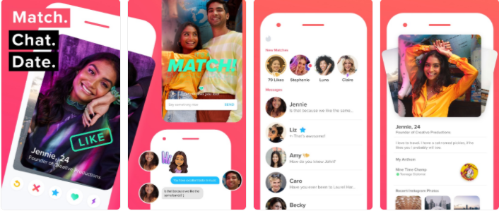
Good Example: Tinder
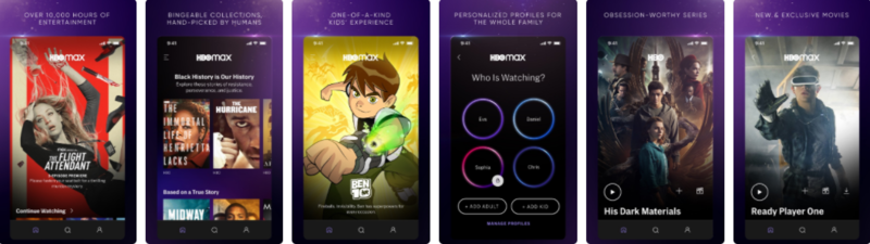
Bad Example: HBO MAX
6. If You Go Global, Localize Your Apps!
If your app is available in multiple languages, make sure to localize your app description, keywords, app previews, and screenshots, for each of the markets in which you offer your app. Many app publishers don’t realize how dangerous it is to underestimate localization impact on the app’s performance. It’s highly important to remember that it’s not enough to merely translate your screenshots captions. Localization is to happen beyond the text. After all, you’re adapting to another culture.
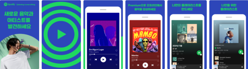
Spotify US

Spotify South Korea
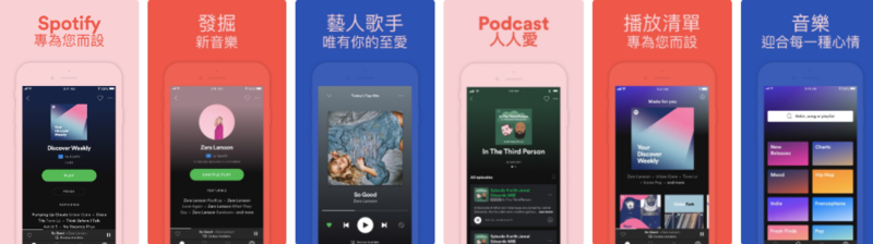
Spotify Taiwan
7. Screenshots Orientation (Portrait vs Landscape)
Choosing between portrait and landscape screenshots is a common ASO dilemma app marketers face. In general, it’s recommended to stick to portrait orientation if possible, as such screenshots are easier to scan quickly and a user can see more screenshots without further scrolling. However, many game apps will adopt landscape orientation. That’s because gamers are used to horizontal screen orientation.
Also, some developers will combine landscape videos with portrait screenshots to make maximum exposure. Here is an example.
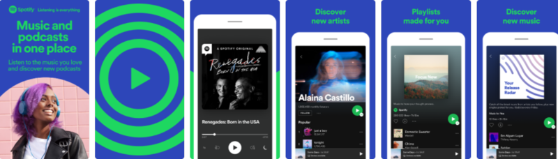
8. App Screenshot Colors and Backgrounds
It all depends on your choice. Usually, some developers will use the same color palette used in their app design. For Example:
Here’re some tips concerning colors used in screenshots:
- Colors shouldn’t contradict the message of your screenshots;
- Less is more: don’t turn your screenshots into a hot mess of various colors;
- Colors should resonate with your target audience. It’s especially important when you localize your product page.
❌ What screenshot backgrounds to avoid:
- Messy image backgrounds with a lot of content
- Background images that aren’t relevant to your offering or brand
- Color schemes that are distracting (eg: bright green background with dark app screen)
9. App Store Screenshots Style
There are many screenshot styles. Here I list 5 most used style for your reference.
1) Classic
They basically depicture in-app screenshots without any additional edits, redesigns or improvers. It’s not the best way to promote a new app. Normally, app store users find it boring and not engaging.
2) Solid/Blurred Background and Device
Many online app screenshot generators provide this design and this sort of layout is quite popular on the App Store or Google Play. The idea is pretty simple: an app publisher chooses a background template, places device in the center, and adds a caption above or under the device.
3) Connected
Sets of ‘connected’ screenshots are also very popular. This type presupposes that each screenshot is the beginning of the next one. Indeed, when you do it right, this style can be really engaging and eye-catching. Nevertheless, it’s not that easy to nail it. There’s a threat of making your screenshots confusing.
4) Tutorials
A set of screenshots in such style normally represents a tutorial on using the app. It’s recommended to use this style if your app encourages a user to interact with their device in a new and unusual manner. Once you decided to apply such style to your screenshots, make sure all instructions are concise and laconic.
5) The Splash Screen
The splash screen screenshots look like an ad which demonstrates app’s features and explains its purpose. The first screenshot usually conveys a principal message of your app. This app screenshot style is a very popular one in the App Store, but not the Play Store, given that screenshots show up in app store search results and thus are used to both represent what the app is all about, as well as catch users’ attention.
10. A/B Test and Test Again
A/B testing is the leading way to maximize your creatives’ performance by comparing app store screenshots to one another, seeing which yields better conversion rates. You’ll learn which style speaks to your target demographic, what design makes users take action, what background color works best and what layouts reel in the most downloads.
For Android apps, you can opt for Google Play Experiments. For iOS apps, you may need to use a third-party A/B testing tool or make use of Apple search Ads.
Please avoid A/B testing several elements & changes at once. If you make several changes: change the screenshots background color, choose another icon, swap the first & the third screenshots – and compare the performance of this new variation to the current one, this makes no sense. Since you are virtually testing several hypotheses at once, if there is a winner, you won’t know which one of them is correct and what exactly affected the result. So, make only one change at a time and test only one element.
Closing Note
Now, you’ve learned the 10 best practices and guidelines for app store screenshots. Following these guidelines, you can make your app more attractive. At the end of this post, I still want to share you 2 more pro tips for designing app screenshots:
- Think carefully what’s the main value of your app and how the key features of your app will be illustrated.
- Don’t use the screenshots for Apple App store in Google Play, vice versa.