How to Use Google Analytics Heat Map
Google Analytics is one of the best tools for tracking website data which includes website’s visitors, their conversion rate, bounce rate, average session duration, page views, and so on.
But have your ever heard Google Analytics Heatmaps?
If this is the first time you hear about Google Analytics heat maps, we have both good and bad news for you.
The bad news: Google stopped supporting its heatmap add-on in 2017.
The good news: Though Google aren’t updating the extension, it continues to work.
In this article, we will discuss Google Analytics heat map, how to use it, and what information it provides.

What Is a Google Analytics Heat Map?
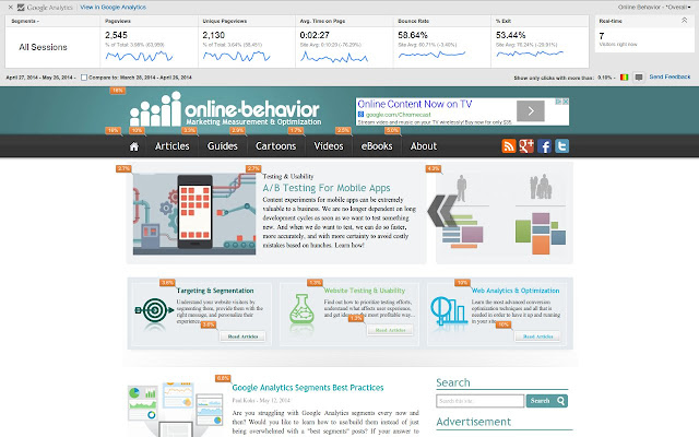
Google offers a heatmap feature through a Chrome extension called Page Analytics (by Google). The heatmap uses Google Analytics data to create a visual representation of your site’s data. It specifically creates a clickmap, which shows where visitors click on your website.
Marketers often use this information to optimize ad campaigns and improve landing pages. By creating a graphical representation of your site’s data, you can easily visualize how people engage with your website and improve UI and UX.

How to Build a Google Analytics Heat Map?
Step 1: Set up your Google Analytics account.
The only condition that needs to be met for using the Page Analytics extension by GA is to have a GA account set up for the website/URL on which you want to use the plug-in.
Step 2: Download and install the Chrome extension called Page Analytics.
After you install the extension for your Chrome browser, you can load a page that you are tracking with Analytics and see the following information:
- Metrics: Pageviews, Unique Pageviews, Avg. Time on Page, Bounce Rate, % Exit
- Number of active visitors, in real time
- In-page click analysis (where users click on that page)
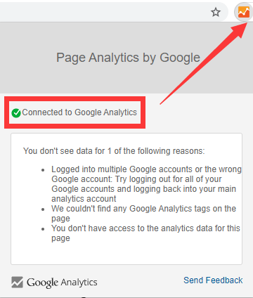
If you can’t view any data, it might be because of one of the following reasons:
- Logged into multiple Google accounts or the wrong Google account: Try logging out for all of your Google accounts and logging back into your main analytics account.
- Couldn’t find any Google Analytics tags on the page
- You don’t have access to the analytics data for this page

Step 3. Build Custom Google Analytics Heatmaps Reports
To better understand the Google Analytics heat mapping, let’s take a look at what else is there on the Google Analytics bar:
- Date Range: The date range menu allows you to select a specific period of time in which you want to see the data. You can also choose to compare two time-frames together.
- Bubble Icon: By clicking on the bubble icon, the percentage of the users who have clicked on each element of the page will be displayed next to it. If you click on each of these bubbles, you can also see the number of clicks.
- Color Icon: If you select the color icon, a color (blue, green, orange, or red) will be assigned to each bubble based on the relative percentage of clicks. Red indicates the most clicked areas, and blue the least.
- Click Threshold: On the click threshold menu, you can choose a threshold for showing the bubbles. You will only be able to see the bubbles for the elements whose clicks are higher than the threshold.
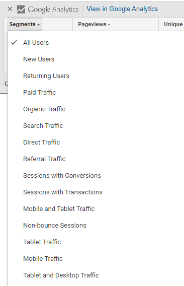
- Segments: This is a list of all the segments you have access to. You can select up to four segments to see their metrics on the Google Analytics bar.
- Real-time or all data: In the real-time section, you can choose to see all the metrics or only the data in real-time.

As you may have noticed, Page Analytics only offers a simple click map. It may not be as effective as a dedicated heat map tool (for example, some tools will record the path a mouse has moved and if it has clicked on a non-linked elements). Here is a list of free heatmap tools which can used as the alternatives to Google Analytics Heatmap. Hopefully all these heatmap tools can help you get more insights from your website.
