20 Best Contact Us Page Examples to Inspire You in 2023
When creating a new website, we need to create an About Us page, Contact Us page and of course, the Privacy Policy Page. Almost every website has these 3 pages.
Previously, we have picked some good About Us templates for you and now let’s check some good Contact Us Page Examples. Here we go!
20 Best Contact Us Page Examples You Need to See
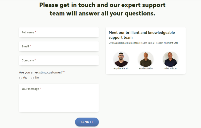
1. BrightLocal
I often visit BrightLocal to check the local search results with their free Local Search Results Checker. And I notice that BrightLocal keeps their contact page simple with email form but personalizes it with names and faces of their support team. This helps users feel like they are connecting with real people and will get a reply.
Also, you can join their Live Group Demos or Discovery Calls (for Agencies and Enterprises) to speak with a member of their Customer Success Team.
? Simple but Personalized
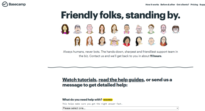
2. Basecamp
Basecamp’s contact us page is one of the most straightforward and easy to use contact pages out there – as a visitor you will be delighted!
By putting a face on their customer support team, they immediately give visitors a sense of friendliness and familiarity plus they also inform you of how long it will take before you will get a reply!
One big issue forms have is not making it obvious which fields are necessary and which are optional, Basecamp helps make this ultra-obvious by highlighting each necessary field with “Required” in bright yellow.
In addition, to encourage proper use of the form such as putting in as much detail as possible to help service the enquiry, they throw in a quick line on why this field is needed and how to best utilize or answer it.
? Straightforward and Personalized
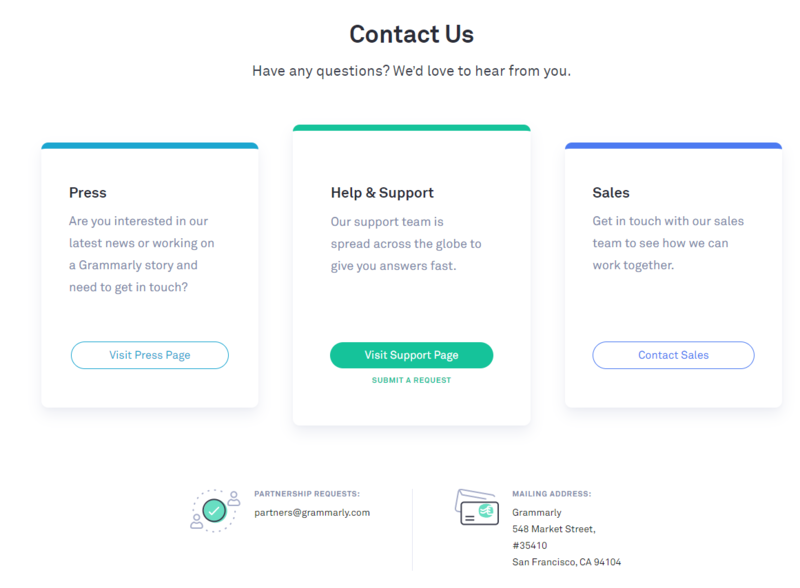
3. Grammarly
Grammarly is another software I like for reviewing written documents for grammar and spelling errors. Its contact page is easy to navigate and makes it simple for visitors to accomplish their goals.
Also, if you have the Grammarly extension installed, it will insert your information into the support forms so you don’t need to spend time filling out the same fields.
? Clear and Convenient
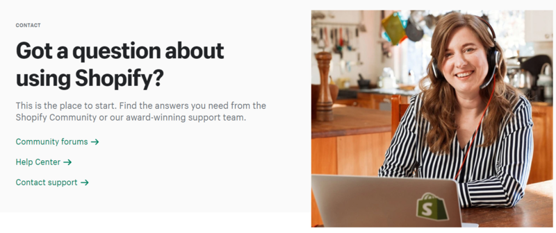
4. Shopify
When I visit the Shopify’s contact page, I’m impressive with the warm welcoming smile in the visuals.
More importantly, it is quite easy for you to find the support you need because Shopify breaks them down. You can directly choose from community forums, help center, or contact information for support.
? Warm and Efficient
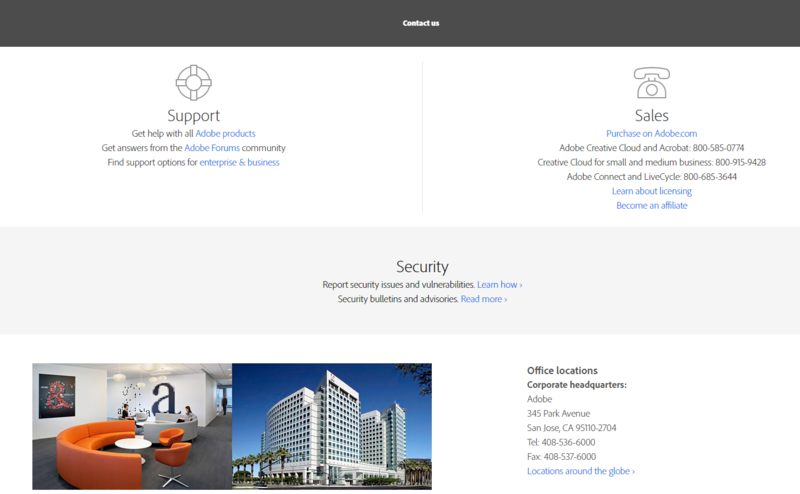
5. Adobe
Adobe also does a great job of segmenting.
Upon arrival, visitors are asked if they are looking for sales or support and, in either case, the user can choose how they would like to receive more information. They can link over to the community forums, be directed to the help desk, or simply call one of the many phone numbers provided.
? Direct and Efficient
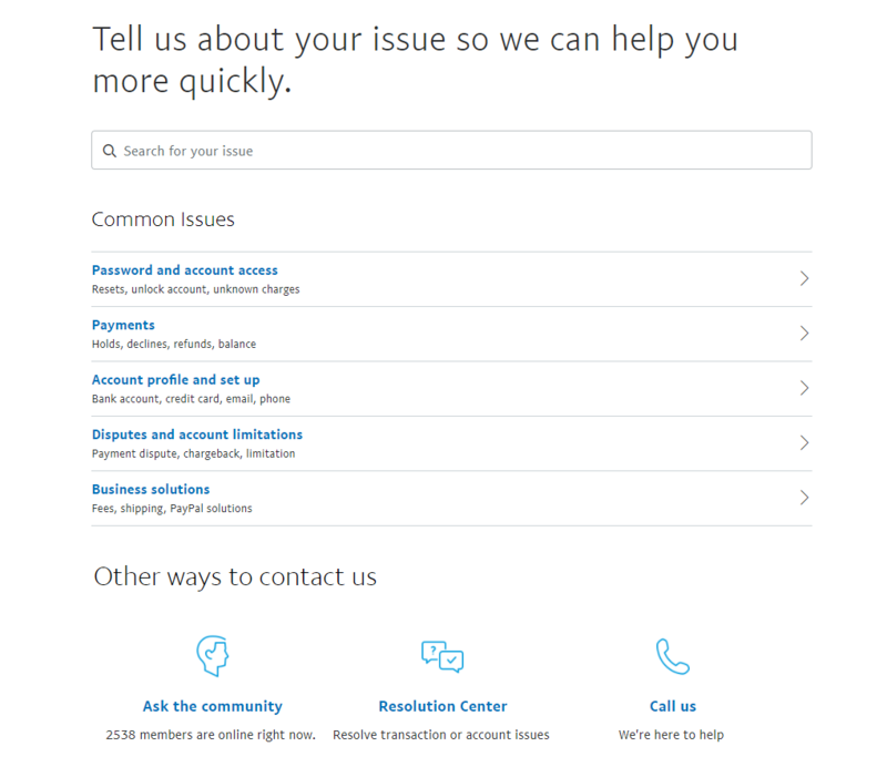
6. PayPal
PayPal’s customer service identifies the common queries it receives with its contact us page. Also, you can easily search for your issues. If you cannot find the answer, you can ask the community or call them.
? Helpful with Search Function
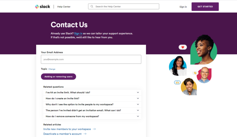
7. Slack
Slack’s elegant contact us page uses a single contact form to handle a whole bunch of queries their visitors, prospects and customers might have – but how do they do it effectively?
With conditional logic fields of course!
By allowing visitors to select one of the most popular topics showcased or typing in their own, they immediately will know what the enquiry is likely about and will recommend you relevant articles and resources that might help you without going through the form.
And what if they still need tailored help?
They’ll just need to click on the ‘Get Help’ button – after all, the topic or issue they need help with is already captured!
?Straightforward and Logic
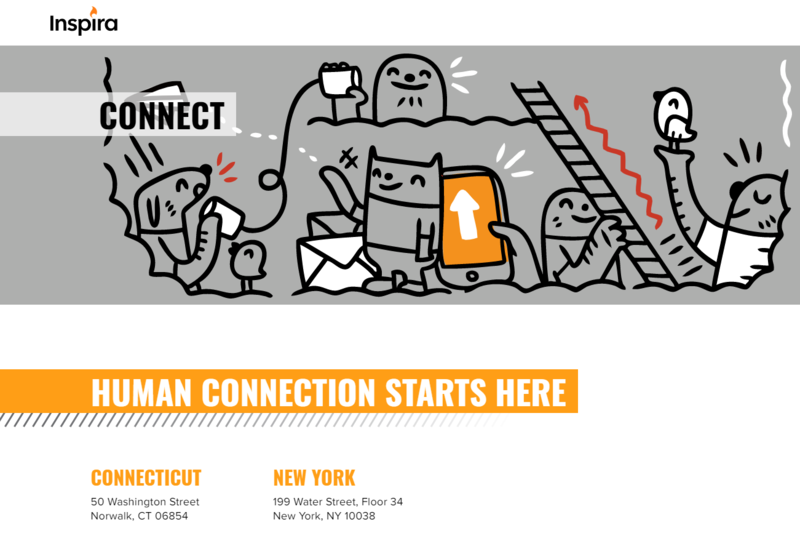
8. Inspira Marketing
As a marketing agency, Inspira Marketing put their efforts into having a branded contact us page. Their first differential is calling the page Connect with the phrase, “Human connection starts here”. To be honest, I feel it is a bit unique and humanized.
When scrolling down, we can see their brand. Their form is also very simple and quick to fill.
? Unique and Humanized
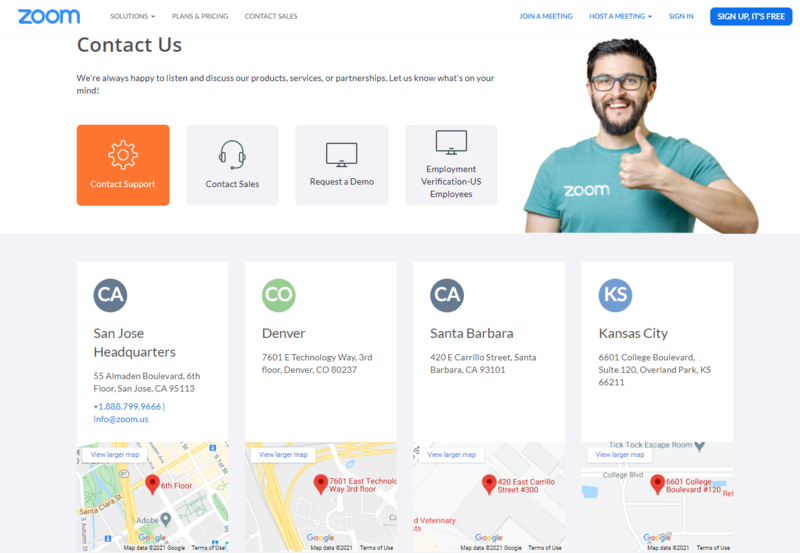
9. zoom
Zoom does a great job demonstrating a clean page design for their users. They have four CTAs at the first sight – Contact Support, Contact Sales, Request a Demo and Employment Verification.
Also, other than the contact us form, you can find the contact details and addresses of offices from around the world. The address of every office is integrated into the map. It helps the visitors to contact the nearby office.
? Direct and Geographic
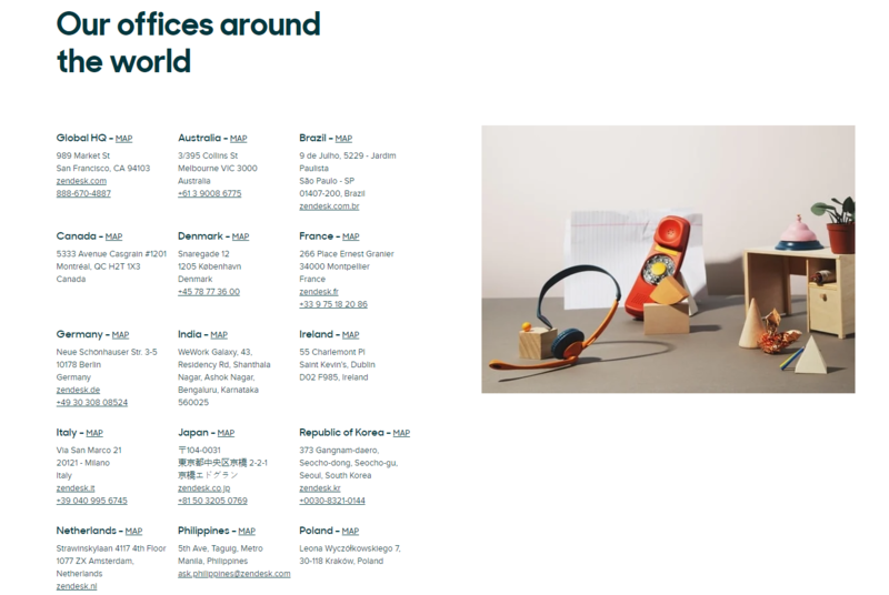
10. Zendesk
Zendesk is a Customer Relationship Management (CRM) service company. Their contact page reflects the conversational idea with an image of a big phone.
The best part is that there are addresses with links for a map of locations worldwide. In addition, the page has multiple ways of contact for each place they have an office in. This helps visitors from different countries to find the support easily.
? Geographic and Thoughtful
11. Coca-Cola
It’s no surprise that a company like Coca-Cola would have a great contact us page.
As the concept of conversational marketing (live chat and chatbots) continues to grow in popularity, Coca-Cola is sure to include it on their website in a creative way.
An easy-to-use chat box appears as soon as you hit the page, making it easy to “Ask Coca-Cola” and get an immediate answer from their knowledgebase.
As you scroll down, you see their general contact info, social icons, and even have a place to submit an idea to the company.
? Conversational and Creative
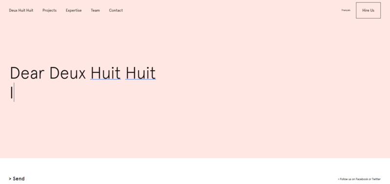
12. Deux Huit Huit
While Deux Huit Huit doesn’t actually give any of its contact details on this page, it makes it very easy and encouraging for website users to get in touch with the company. You can directly begin with ‘Dear Deux Huit Huit.’
? Fun and Memorable
13. Molamil
This image of the lads at Molamil is one that will certainly stick in your mind.
? Fun and Memorable

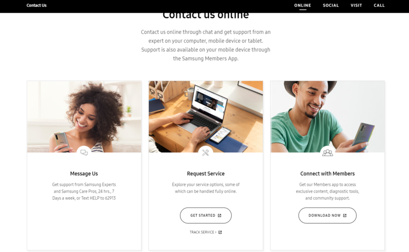
14. Samsung
Samsung has a comprehensive example contact us page. At the top of the page, it provides 4 ways for users to contact them – Online, Social, Visit and Call. This makes it easy for users to select the exact way they want to get in touch with Samsung, instead of searching for it.
?Convenient and Comprehensive
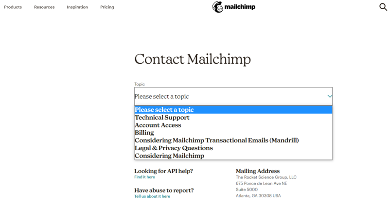
15. Mailchimp
Mailchimp indicates the name of the company and the scope of its activities in the header. The user should immediately notice and understand which company’s website he or she is visiting. Many users skip the main sections and immediately proceed to the “Contacts” page.
16. World Health Organization
Not every contact us page has to be complex, sometimes keeping it simple can be the best way to direct your visitor to the right avenue to leave the enquiry.
WHO does this well by simply using text and relevant links to direct visitors to where they need to go – nothing fancy, just information and where to go next.
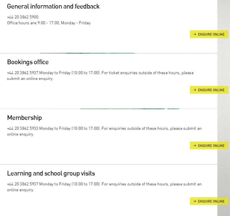
17. Design Museum
The Design Museum company does a solid job of breaking apart its department. They might be able to clean this up with an FAQ or accordion-style design, but overall the buttons and call to actions stand out.
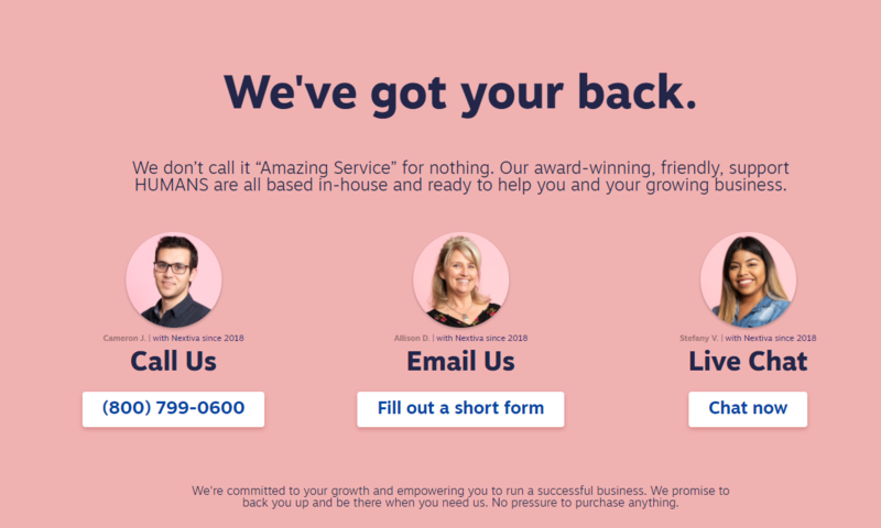
18. Nextiva
Nextiva’s contact us page is a great example of giving your prospects and customers multiple options to contacting your business.
From calling and emailing to even a live chat, visitors can select the avenue that best suits them and how urgent their enquiry is.
What’s more, Nextiva features the customer support team member that is in charge of each contact option, helping to ensure the visitor that their enquiry will be handled by a real-life human being and not just some robot that will spit out a generic response.
19. Bluehost
As a website hosting business, the main reason why anyone would get in touch with them would be to handle technical and urgent issues such as customer websites crashing or going down.
Bluehost knows this well and the first thing they showcase is an instant live chat or a number to call their helpdesk.
They locate the rest of their contact points towards the bottom of the page and address the biggest issues first and give priority to their customers facing problems with their service.

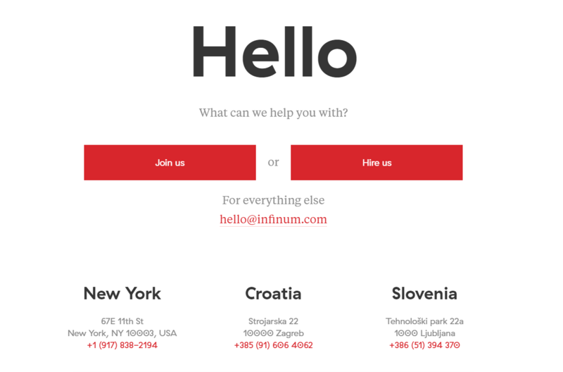
20. Infinum
Sometimes the “short and sweet” route is the way to go. App development company, Infinum nails this simple approach.
As soon as you arrive on the page, you’re greeted with a giant friendly “Hello.”
From there, they let you know they’re here to help you and you’re presented with three simple options. The page is clean, the available actions to take are very clearly displayed, and the limited amount of content on the page is easy to read.
Contact Us Page Best Practices
- Make Sure Your Contact Form is Working
After adding a contact form to your site, it’s important to make sure that it is working properly by sending a test submission.
- Avoid Unnecessary Fields in Contact Form
You can add as many fields to your contact form as you like. However, each additional field you add to your contact form makes it more time consuming for your users to fill them.
That’s why we recommend that keeping your contact form fields to a minimum level and only add fields that truly help you better understand the user’s question.
- Explain Why Users Should Contact You
Let users know what kind of questions you can help them with. If you have different pages for different departments, then point users in the right direction.
- Provide Alternate Ways to Contact
Adding a form to your contact page is the most convenient way for users to send you a message. However, adding alternate ways to contact can help users decide what works best for them.
You can add an email address, Facebook, or phone number as alternate ways to contact.
- Provide Hours of Operation Information
If you’re only open certain days of the week, let your visitors know to give them an idea of when they should expect to get in touch with you.
- Adding FAQs and Links to Resources
After a while you will realize that many of your users ask similar questions. You can help them save some time and answer those questions directly on your contact page by adding a FAQs section.
- Add Photos of Your Team
Adding photos of your team members and staff on the contact page makes it more personable and welcoming. It ensures them that there are real people behind your contact form page who will be answering their questions.
- Make Contact Us Page Easy to Find
Once you have your page complete, the next one of the contact us page best practices is where to link to the page.
At a minimum, the link to the page should be in one of two key locations. Ideally is added to both of locations.
- Header (main menu or above header menu)
- Footer
Bottom line
If you’re thinking about revamping your contact us page, keep our best practices and examples in mind and just, be inboundy! You should always think about how you can be more helpful to your users.