Google Play Feature Graphic Best Practices and 10 Examples
Contents
Feature Graphic is an important asset on Google Play. It is used to convey your app or game experiences and attract new users. Also, you must upload a feature graphic before you publish your app or game on Google Play Store.
The Feature Graphic is an important aspect of a Google Play Store listing and App Store optimization. If you want to make the most of your Feature Graphic, you need to understand how it works and what its best practices are. Here we go.
What Is the Feature Graphic and Where It Displayed?
The Google Play Feature Graphic is a promotional feature from Google that visually sums up the essence of the app. When visiting the Google Play Store via the browser of your computer, the feature graphic is not displayed. On Android devices, the feature graphic may be displayed in the store in some cases.
Previously, the feature graphic was the first thing your potential users see when they open your app’s store listing. However, since the Google Play Store redesign in 2018, the feature graphic is now not displayed at the top of an app’s store listing. Then, where is it displayed now?
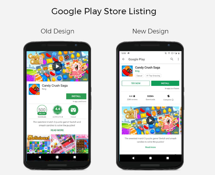
If you have a promo video, your feature graphic will be used as the cover image with a Play button overlaid on top.
If you do not have a promo video, the feature graphic will not be displayed on your listing. But the feature graphic can also be displayed:
- When doing a brand search;
- In the “Recommended” section on the Play Store;
- In the Ads section on the Play Store (if you’re running Google’s App Campaigns and they are displayed on the Play Store).
All in all, the feature graphic is very important to promote your app or game.
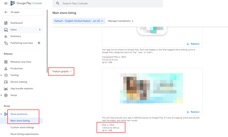
How to Upload Your Google Play Feature Graphic?
In the Google Play Console, go to your store listing. In the Graphic Assets section, below your screenshots, you’ll find where to add your feature graphic.
Here are the requirements and sizes for the Google Play feature graphic:
24-bit .png (no alpha) or .jpeg
1024px by 500px dimensions
10 Great & Bad Google Play Feature Graphic Examples
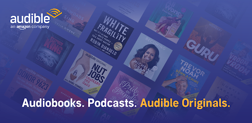
- Audible
The layout of Audible’s feature graphic is actually pretty good. The app’s value proposition is summarized at the bottom, and they use the logo.
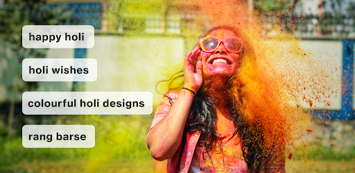
2. Pinterest
This is an interesting example of using a feature graphic for special occasions like Holi Festival in India.
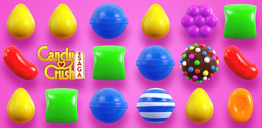
3. Candy Crush Saga
The game’s name is leveraged with the logo in the left, but not too big so that the focus stays on the game elements used. The colorful game elements definitely grab the attention.
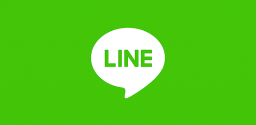
4. Line
The Good: Line uses a plain background with a logo icon and the app’s name. This approach is popular for its simplicity and relying on the rest of the app listing to do the selling.
The Bad: Do not use prominent branding that is similar to your app icon, as this will cause duplications when shown in context with your app icon. Optimize for branding elements that serve as an extension of your app icon. (Source: Google Play Content Guidelines)
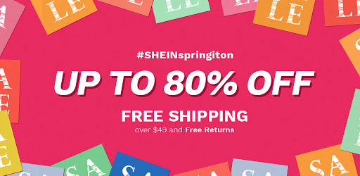
5. SHINE
As a shopping app, Shine focuses the visitor’s attention on discount and promotion which conveys simple but attractive message.
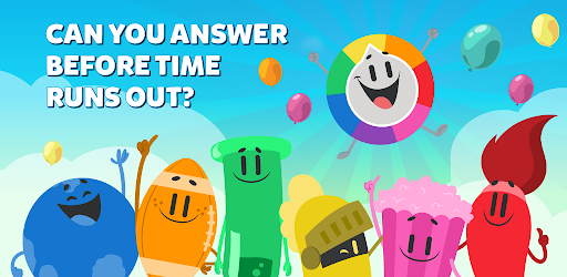
6. Trivia Crack
Trivia Crack here asks a question in the feature graphic. This may arise the curiosity of users to download the app and have a try.
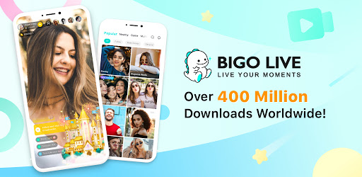
7. BIGO LIVE
The Good: This example uses two app screenshots, framed inside modern Android devices, along with accent text to highlight the number of app users to capture the user’s attention.
The Bad: Avoid any content that reflects or suggests Google Play performance, ranking, user testimonials, accolades or awards, or price and promotional information. For example, do not use words like “Best,” “#1,” “Top,” “New,” “Free,” “Discount,” “Sale,” or “Million Downloads.” (Source: Google Play Content Guidelines)
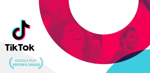
8. TikTok
TikTok show social evidence which is convincing.
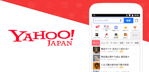
9. Yahoo! JAPAN
This example uses a app screenshots, along with lively logo to capture the user’s attention.
10. PUBG Mobile
PUBG Mobile uses feature graphic for anniversary event.

Best Practices for Google Play Feature Graphic
- Don’t Create a Text-Heavy Advertising-Style Graphic
Remember, users will only have a few seconds to see the Feature Graphic. They need to be able to understand it at a glance.
- Show Your Value Proposition
Your feature graphic needs to include a value proposition or core features to connect with users.
- Include the Logo
Your logo is a key aspect of your branding. The Feature Graphic should reflect that. Place the logo in an area where it’s clearly visible without distracting from the Feature Graphic’s artwork.
- Localize
If you’re targeting multiple countries, localize your graphic and texts appropriate for different markets and languages.
- Temporalize
Each new feature graphic offers a new way to attract users and highlight the benefits of your app. Change the feature graphic for special occasions like Christmas or Valentine’s Day or different promotions, events, or marketing campaigns linked to your company.
- Be aware of the play button
This is not overly complicated, but needs to be taken into account: if you have a promo video there will be a play button in the middle of your feature graphic. This button may block part of the image. Don’t place the most important element there.
- A/B Testing
Since the feature graphic is one of the most important App Store Optimization assets on the Play Store, you’d better A/B test before updating it to your app store listing.
- Don’t Repeat the Feature Graphic in Your First Screenshot
There is no need to have a first screenshot being the same. Doing that means you risk losing people exploring the rest of your screenshots.
That’s all we got. A lot of it is common sense, yet several Play Store listings could easily make improvements to their Play Store feature graphic. Hope these examples, tips and best practices will be useful to you! To improve your play store listing, you can keep reading our screenshot best practices.